How a Popcorn Bathtub in Port Douglas Landed Me on a Swiss Billboard
A programmer at a fringe festival is scrolling through 400 applications and your poster is the first thing they see. A producer is Googling your show name and your key art is the first image that loads. A performer who worked with you three years ago is recommending you to their new director - and they're sending your poster as proof.
A photoshoot that started it all.
A few years ago, I was hired to photograph a group of performers for a spiegeltent show in Port Douglas - tropical Far North Queensland, about as far from Switzerland as you can get.
The brief was simple: bold, colourful, fun. Popcorn everywhere. Performers covered in it, bathing in it, throwing it. The kind of images that make you stop and look twice.

I didn't think much about where those images would end up beyond the immediate campaign. They were shot for one show, one season, one venue. But images don't stay where you put them.
Good promotion travels across the globe.
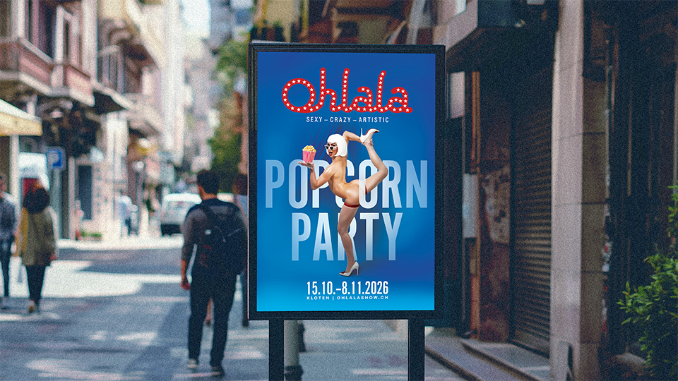
Here's something most performers and producers don't think about enough: the performing arts industry runs on word of mouth, but the currency of that word of mouth is visual. When a performer moves from one show to another — from a spiegeltent in Far North Queensland to a cabaret production in Switzerland — they carry names with them. Photographers they loved working with. Designers who made their show look incredible. And when a producer asks "who should we use for our poster?" the answer usually comes with an image attached.That's exactly what happened. One of the performers from that Port Douglas show moved on to work with Salto Entertainment — a well-established Swiss production company behind Ohlala, a cabaret-circus fusion that's been running for over a decade. Sexy, crazy, artistic. That's their tagline, and they mean it.The CEO of Salto had seen my Port Douglas work. The popcorn. The colour. The energy. She got in touch because she wanted that same feeling for their upcoming season — "Ohlala: The Popcorn Party" — and she wanted it on billboards across Switzerland.
Most performers think of their poster as a practical necessity — something they need to put on Facebook, print for the venue, and attach to their festival application. It's an admin task. A box to tick.But a poster is working for you in ways you never see. It's on the wall of a venue where a programmer is deciding next season's lineup. It's in a WhatsApp group where a producer is asking "who designed that?" It's in the Instagram feed of a performer who's about to recommend you to their next production company.Your poster is your first impression with people who will never see your show before deciding whether to book it, programme it, or invest in it. It's showing every performer, producer, and ticket buyer who sees it what you look like as a brand. Who you are, what you do, what quality you prefer.When you invest in that impression — when you work with a designer who understands your show's personality and builds the key art around it — that image doesn't just sell tickets for one season. It becomes your visual reputation. And it travels.
The concept call that changed the pace.
When Salto first reached out, the brief came over email. References, photo selects, brand guidelines — all useful, but all flat. We went back and forth for weeks, narrowing the direction, but something wasn't clicking.Then we got on a video call. Across timezones, Brisbane to Switzerland, 45 minutes. And in that call I understood more about the show, the brand, and what the CEO wanted than the entire email thread had given me. I could see her face when she talked about the show. I could hear which ideas made her voice change. I could read the difference between "yeah that's nice" and "that's it."
This is why I push for a concept call on every Platinum Poster Pack. You can't design for someone's creative instincts if you've never seen their face. The poster isn't just solving a visual problem — it's translating a feeling the producer has about their show into something a stranger on the street understands in two seconds. That translation happens in conversation, not in email.
We worked on two variations.
We developed two completely different poster concepts — a red version and a blue version — each with its own visual personality. Custom photography shot in London specifically for the poster. Pop art meets cabaret pin-up. Popcorn as both a design element and a playful visual device.The client printed both at poster size and held them side by side in a team workshop before making their decision. That's the level of commitment to visual identity that separates a production company from someone who downloads a Canva template the night before their show opens.
The blue concept won. Bold, camp, unapologetically theatrical. Heading to billboards in Kloten, Switzerland, for the 2026 season!
What does this mean for your show?
You don't need a Swiss billboard to benefit from this principle.
Whether you're performing at Adelaide Fringe, Edinburgh Festival Fringe, Brisbane Comedy Festival, Perth Fringe World, or Melbourne International Comedy Festival — the dynamic is exactly the same.Your poster is doing sales conversations you'll never know about.
Someone you've never met is forming an opinion about your show right now.
The question isn't whether you can afford to invest in professional key art. It's whether you can afford not to, when every image you put into the world is quietly building, or undermining, your visual reputation.
Currently booking Platinum Poster Packs for the 2026/2027 festival season.
If you're working on a production and want key art that's built around your show's personality — not a template — I'd love to chat.